Personal portfolio website
My personal portfolio, with WPA-inspired artwork, choreographed navigation, and custom tools for publishing the things I make.
- Status
- Ongoing
- Development
- Solo, with AI
- Stack
- React / TypeScript
- Hosting
- Google Cloud
Portfolio notes
Why I made it
When it was time to renew my domain, I realized my old website was woefully out of date. I don't do much social media, but I am constantly building and tinkering with things. I wanted somewhere to put my work that isn't work: the projects, experiments, and prototypes that I find creatively fulfilling.
I wanted the portfolio itself to be a creative project. It was really freeing to let aesthetics drive a lot of the decisions and spend time getting things to look and move the way I wanted.
Project notes
Making PatrickDoring.com
Finding the look
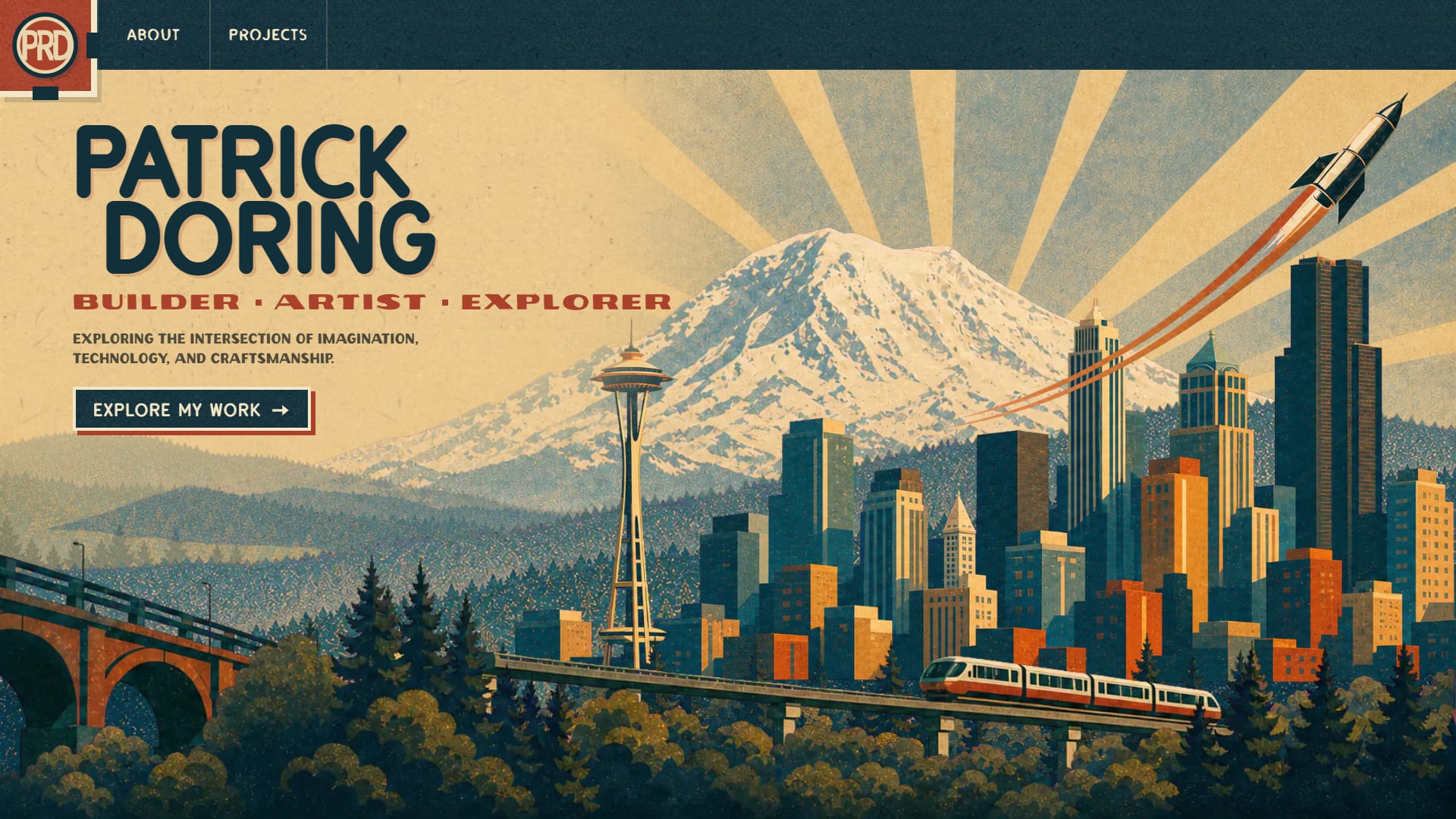
I initially planned a retrofuturistic look, but while exploring similar design styles I ended up going with WPA styling. It really speaks to me as an outdoorsman and felt right for a site holding things I've built out of a sense of adventure.
Mountains, a Seattle skyline, a bridge, and a rocket became the pieces of the front page. Broad shapes, overlapping colors, paper texture, and poster lettering gave me a direction I could carry through the rest of the site.
Getting my ducks in a row
It's basically 100% vibe coded, but just because it's vibe coded doesn't mean it should feel vibe coded.
For this one I spent a good bit of time iterating with an image model on concepts, then building out an SVG pack and style guide before getting into the code.
Getting the paper right
The sunburst artwork already had a fibrous paper quality I liked, and I wanted that to carry into the rest of the site. Early texture experiments looked more like parchment, so I kept working toward the uneven surface of construction paper. A crop from a fibrous paper reference is mirrored in both directions so it repeats without seams. Its shading lives in a transparent layer, which lets me tune the paper color independently.
Dark ink gets a different treatment: a tighter texture with both pale fibers and dark flecks, so the grain stays visible on navy. Flat print-offset shadows, halftone artwork, and different lettering for headings, labels, and navigation carry that printed look through the rest of the interface. The paper itself stays still beneath the moving content during page transitions.
Getting the pieces EXACTLY where I wanted them
There were still plenty of frustrating moments getting the layouts and choreography to match what was in my head. The overlapping pieces on the hero were a good example. I wasn't getting the placement I wanted by describing adjustments to the AI.
I ended up vibing up a single-page layout tool so I could move, scale, flip, and reorder the layers myself. It output JSON with their exact positions, which I could hand back to the AI. A fun little side project to the side project.
The movement got the same attention. The opening assembles the poster, and navigating away breaks it back into its pieces. Headings, cards, and images each have a part in the page-change choreography.
That choreography also shaped the routing. A normal route change would remove the outgoing page before it could finish its exit. A React Suspense gate keeps it mounted while its elements animate out and the next page loads. The new view takes over when both are ready. Its entrance also waits for key images and fonts to be ready, so the photographs and lettering can arrive with their frames.
On phones, the poster uses a different composition. For people who prefer reduced motion, the site shows the settled artwork and skips the animated choreography.
Room for different kinds of work
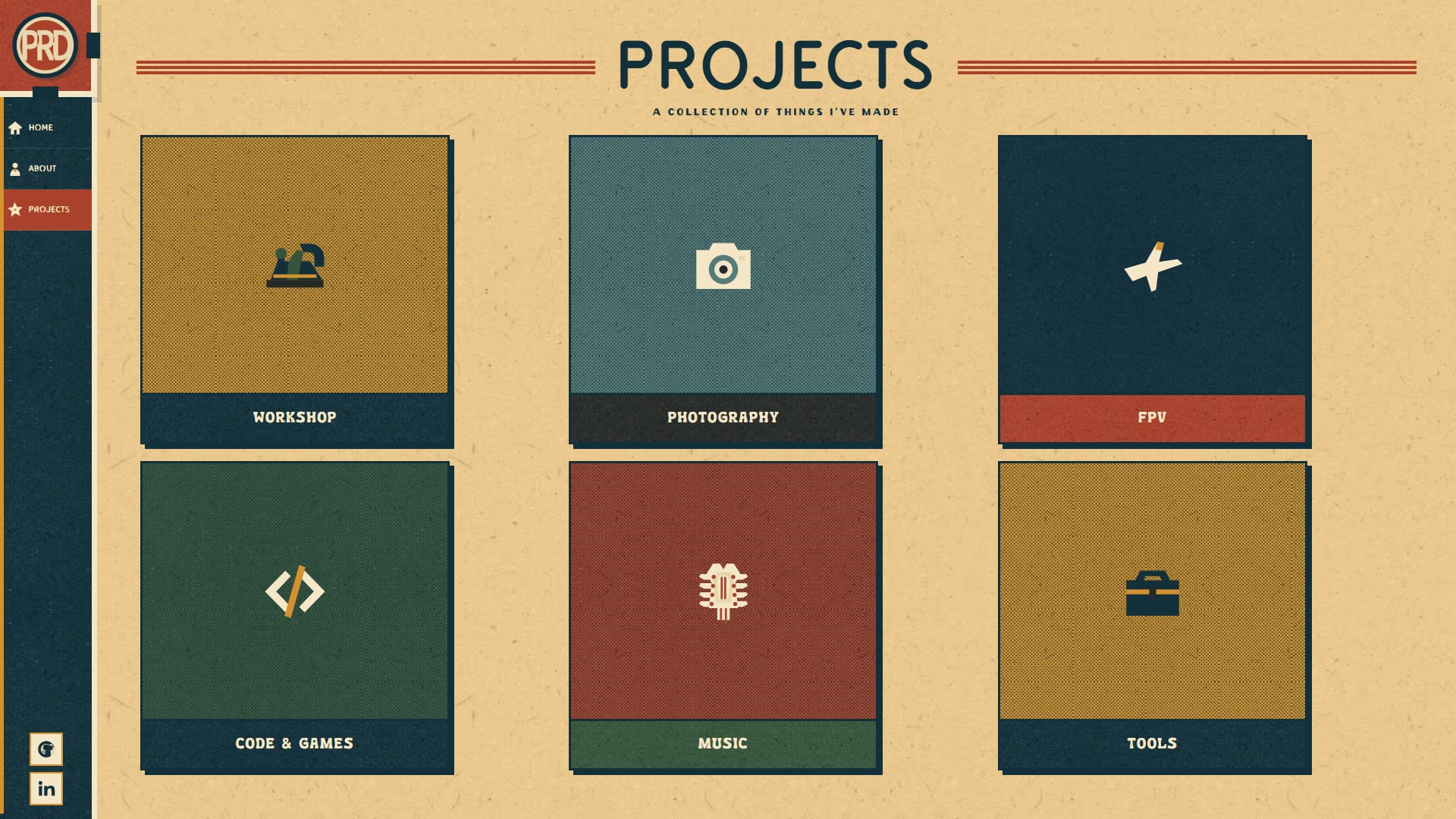
A mandolin build journal, a photo collection, a film, and a software project need different ways of telling their stories. The content system lets me combine Markdown with galleries, video, chapter navigation, and project overviews.
For photography, I wanted something closer to Lightroom's continuous sheet of images. The gallery arranges uncropped photographs into rows with narrow paper gutters between them. The photographs keep their own colors, and opening one displays it in a dark lightbox. The poster styling belongs around the work, without having to become part of every image.
Bringing the code projects along
I wanted a GitHub-backed post to read as a native portfolio page. Pasting a public repository URL into the authoring console imports its README and project details. The README gets the site's typography, section navigation, and page choreography, with expandable images and relative links resolved back to the repository. I can write an introduction around it, choose a cover from its images, and give it a portfolio title and summary without changing the repo.
Journals and READMEs share a table of contents beside the article. It highlights the current section as you scroll. I first worked out that layout for the code pages, then brought the long mandolin journal into the same design language.
GitHub-backed posts can refresh their READMEs from GitHub, with a deployed snapshot to fall back to if GitHub is unavailable. README import saves me from updating the same documentation in two places. Projects with private repositories, including this website, use an overview written for the portfolio instead.
Beyond a few featured projects, the code list is ordered by recent GitHub pushes, so it follows what I'm working on.
Making it easier to add things
The authoring console needed some iteration of its own. An early version made me leave the post to import and manage photos in a separate media library. I reworked it around editing inside the post: adding photos where I'm writing, rearranging a gallery visually, or working through a journal chapter by chapter. I can import files, image URLs, or a Google Photos album and preview the actual page after saving. Imported photos are processed and served from the site's own storage, so a gallery doesn't depend on the original album staying available.
I wanted shared links to look like they belonged to the site too. The homepage's link preview uses its hero artwork, and project share images are generated from a cover or an image I choose, using the site's lettering, category colors, and PRD seal. I can adjust the crop's focal point in the console. Each post gets its own little poster for sharing without me having to make another graphic by hand.
A little game on the contact form
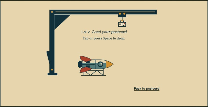
The contact form became a postcard, which seemed like a good opportunity to do something playful with sending it. I made a little game in place of a conventional CAPTCHA: load the postcard onto a rocket, aim, and launch it.
Under the paper
The site runs on React and TypeScript with React Router server rendering. The writing and configuration live in Markdown and JSON files in git. A build validates them and compiles the project, media, and routing data into a read-only SQLite database that ships with the app. Publishing a content change is a deployment. The writing has a readable version history, and the server can query a local file rather than making a network round trip.
Images are processed into responsive AVIF, WebP, and JPEG versions. Those files live in Google Cloud Storage behind a CDN, while the app runs on Cloud Run. The production site doesn't need the authoring console to serve a page.
Having the assets and style guide in place before coding helped keep the paper treatments, lettering, and layouts consistent as the site grew. I'll use that approach again.